Review: Windows 11 Brings Refreshing Design, Improved Productivity And Some Questionable Changes
While the UI overhaul and new productivity features are largely welcome, Microsoft also restricts customizability in a number of new ways in Windows 11.
While the biggest updates for business users with Windows 11 are under the hood—i.e., the advancements in security—there are plenty of other changes relevant to businesses on the way.
They may not be as important to businesses as security, but how workers actually use their PC still matters a lot, of course. I’ve been trying out Windows 11’s new user interface and productivity features, and what I’ve found are some changes that are very welcome—and others that are much less so.
Microsoft’s Windows 11 operating system, the successor to 2015’s Windows 10, goes into general availability on Tuesday.
[Related: Windows 11: Partners See Complications In Rollout Amid PC Shortages]
Without a doubt, upon entering the Windows 11 universe, you have the feeling that you’ve entered a very different place. It’s more like Apple’s macOS, certainly, but still feels like Windows to me. I’d argue that Microsoft has succeeded at getting a reaction that “this feels like the future” in the Windows sphere.
At least upon launching into Windows 11 for the first time. After a bit of use, you’re bound to find some things that you’re not excited about, cannot change and will have to get used to. And this does seem to be a theme with Microsoft’s approach to Windows 11: the operating system restricts adjustability and customizability in a number of ways that Windows users have not seen before.
I’ll come back to that shortly. First, it’s worth mentioning what Microsoft has said about the pandemic-era thinking that informed the design overhaul in Windows 11. In a Medium post, Microsoft design team members characterized one of the key guiding design principles for Windows 11 this way: “calm technology ... makes our lives genuinely better.”
“Calmness is much needed in today’s world, and it tends to hinge on our ability to feel in control, at ease, and trustful,” the Microsoft design team said in the post—going on to say they have sought to “soften” a UI that was “formerly intimidating.”
“We made Windows 11 more human and welcoming by softening edges, reducing clutter, and designing for consistency,” the team said.
On an aesthetics level, I think Microsoft has largely pulled this off. The overall vibe of the design does feel calmer and more pleasant—“softened” seems like an accurate word for it. Windows 10 was an improvement over Windows 7 in these regards, but it was still sort of a mess, in many respects. For several of the big changes in Windows 11, Microsoft has simplified the visual design to cut down on the chaos that Windows users have likely become so accustomed to that they stopped noticing it. Once it’s gone, as it is now in Windows 11, it feels like a bit of a relief.
A chief example of that is with File Explorer. In Windows 11, File Explorer is drastically simplified—or “decluttered,” as Microsoft has put it. In Windows 10, the File Explorer context menu crams in a vast array of commands. In Windows 11, that mess has been replaced with a single row of icons for key commands such as cut, copy, rename and delete. Much cleaner, much less chaotic.
In addition, right-clicking an item in File Explorer brings up a condensed list of possible actions for what to do with that file. Redundant commands, such as the ones mentioned above, no longer come up when you right-click.
Settings has also been overhauled. It looks nicer and is now a bit faster to use, too.
Other changes meant to promote a sense of calm and ease are more cosmetic. Many apps now feature rounded corners, a la macOS. In addition to Microsoft apps such as Outlook, Teams and the Edge browser, apps including Netflix, Spotify and (surprisingly) Google Chrome also have rounded corners. For some reason, many key Microsoft apps do not—including Word, Excel, PowerPoint and OneNote.
One of my favorite changes is a small delighter, which you’ll probably notice right away: many of the animations have changed. That includes the animation for opening, closing and resizing windows/apps.
In Windows 11, when you resize, minimize or open a window, the animation is a lot smoother and “cooler looking” (for lack of a better descriptor). It seems faster too. The animation for opening and closing windows is now very similar to iOS, in my opinion. And when you automatically resize a window, it now glides smoothly to its smaller or larger size.
By contrast, in Windows 10, these actions cause the window to sort of stutter, almost as if something has gone wrong for a second, in reaction to your click. It’s one of the many things you have completely stopped noticing in Windows 10, but you’ll feel a little bit lighter in Windows 11 now that it’s gone.
Opening the Start Menu, meanwhile, also gets the same cool little improvement for its animation of popping up from the bottom of the display.
That is, unfortunately, one of only two nice things I have to say about the Windows 11 Start Menu.
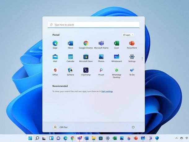
In Windows 11, the Start Menu is centered instead of on the left side of the screen as in the past. Like with the changes to File Explorer, the philosophy with the Windows 11 Start Menu seems to be focused around simplification and getting rid of the clutter. For one thing, live tiles are gone. While I’ve never been a fan of the “live” aspect of live tiles, I like that the space allocated for the tiles is yours to customize however you want. Along with choosing your tiles and placing them wherever you want, you can pick from three different sizes for the tiles.
This level of customizability is gone in the Windows 11 Start Menu.
The Windows 11 Start Menu is certainly prettier than its counterpart in Windows 10 (there’s the second nice thing), and more compact in size. But the only personalization you get with the Windows 11 Start Menu is choosing which apps or folders you want to put in the three rows allocated to you (there’s room for 18 apps/folders in all).
Below the search bar and the three rows, taking up at least a third of the Start Menu real estate, is a “Recommended” section. This section includes files and apps that Microsoft thinks you’ll want. And there’s no ability to replace the Recommended area with something else.
If you don’t like Microsoft’s recommendations, all you can do is make this section vanish by turning off the display of recently added apps and recently opened items in Settings. That leaves the Recommended section blank—almost. In its place, there’s now a reminder from Microsoft that you can turn those things back on in Settings. So now, every time you open Start, you get to see that oh-so-helpful reminder (pictured in the screengrab above).
To me, this sort of thing is the very opposite of promoting ease and calm. It’s also just not an efficient design choice. I don’t need live tiles, but some ability to personalize this space—and not have it personalized by Microsoft—would be ideal.
Speaking of radical changes in Windows 11 that are also questionable, it’s time to discuss the taskbar.
Windows 11 introduces a more-minimalist taskbar, which is centered by default (macOS influence again, perhaps). You can also align the taskbar to the left.
On the face of it, I like the look and the idea of the new taskbar. But other changes with the taskbar reinforce the theme of Microsoft taking away customization options for users.
A biggie is that you can no longer move the taskbar to the three sides of the screen. I’ve never been drawn to do that myself, but for users that are accustomed to that setup, this restriction could be a huge downside of Windows 11.
Another thing that Microsoft takes away on the taskbar is the ability to right-click and pull up the task manager and a list of settings for customizing the taskbar. Now, right-clicking just pulls up the taskbar settings shortcut. This seems to be an example of Microsoft trying to remove clutter—but taking away functionality that some users rely upon in the process.
There are different ways to promote “calmness” in an operating system. And using your PC won’t be a very calming experience if it’s now impossible to use it the way that you’re familiar with.
Without a doubt, Windows 11 takes some things away from users. But apart from design changes, what new things does it give?
One new element is widgets, a section that pops out from the left side of the screen to display weather, news, calendar, traffic and so forth. This seems to be Windows 11’s customization zone—here you can pick the widgets you want to see, get rid of the ones you don’t and move them around as you please. To me, it doesn’t cancel out the Start Menu fumble, and I haven’t been using it long enough to judge whether it’s something I’d personally use. But it seems to have potential.
Other additions in Windows 11 include several new productivity features.
The most hyped is Snap Layouts, which helps us multitaskers with quickly arranging our apps into a split-screen mode (especially useful when working with an external display). It’s a cool and useful feature. While snapping your apps was possible in Windows 10, it’s a lot faster and easier in Windows 11. Hovering over the window maximize button lets you quickly put together a split screen with two, three or four windows. (I’ve seen demos showing the ability to snap up to six windows, but this didn’t seem to be enabled in my tryout version of Windows 11.)
Long story short, Snap Layouts works great and could be a real time saver. The key is that Microsoft has made this really simple. It’s very intuitive and takes just seconds to set up your layout the way you want it.
From there, another new Windows 11 productivity feature, Snap Groups, lets you minimize or maximize your entire Snap Layout. This one is a little less intuitive—you hover over an app icon on the taskbar, which shows you your “group” of snapped windows, and then right-clicking lets you minimize the entire group. The group layout can then be restored by hovering on the taskbar and clicking the group.
If you’ve attached a laptop to an external monitor, Windows 11 is also capable of remembering your Snap Group that you’d previously been using on the monitor—allowing you to quickly return to what you were working on. This worked flawlessly in my tryout, with a four-panel layout immediately re-appearing on the screen upon plugging in my monitor cable—no need to even select the group to get back to it.
An additional Windows 11 feature primed for multitaskers is an easier way to use multiple desktops. Microsoft has included a button in the taskbar that, when hovered over, allows you to create a new desktop or switch between existing desktops. You can toggle off the button in Settings if you don’t need this functionality and it’s just taking up space for you in the taskbar.
As for the Teams integration in Windows 11, where you can use Teams directly from the taskbar, this is actually the consumer version of Teams. This wasn’t clear to me when Microsoft first announced Windows 11, though I suppose that from an antitrust point of view—especially for a company with Microsoft’s history—the commercial version of Teams can’t be baked into the operating system.
Anyway, the ability to quickly send out a message or start a call from the taskbar seems like a neat feature, but not one that’s relevant to people using Teams for work.
The bottom line with Windows 11 is that while many will enjoy the refreshed UI, I see a strong possibility that certain changes may be a dealbreaker for some users. The new productivity features are nice, but may not be enough to make up for those changes for everyone.
For such people, they’ve still got another four years with Windows 10 before Microsoft stops supporting it. And maybe by then, Microsoft will have fixed the Start Menu and taskbar in Windows 11.
Windows 11 goes into general availability on Tuesday as a free upgrade for compatible Windows 10 devices, and on new PCs from all major vendors.